The system against the system.
A typeface system built from binary code. The link between data and you.
Jan A. Wojtaś
CHOOSE YOUR GLYPH SOURCE
Select how you want to represent the binary cells (1s and 0s) in your custom typeface.
Use a Font
Pick characters from a library font (e.g. Space Mono or Courier) or upload your own TTF/OTF font file.
Upload Images
Upload raster images (PNG, JPG) and automatically convert/trace them into vector paths for each cell state.
Draw Your Own
Use the default geometric system (vertical bars and circle rings) and adjust their stem weights.
CUSTOMIZE GLYPH 1 (ACTIVE CELLS)
Upload an image or select a character to represent cell state '1'.
CUSTOMIZE GLYPH 0 (INACTIVE CELLS)
Upload an image or select a character to represent cell state '0'.
CUSTOMIZE TYPEFACE GEOMETRY & STYLES
Fine-tune cellular layouts, sizes, and coloring rules. Review the live rendering preview below.
EXPORT YOUR TYPEFACE
Your custom typeface is ready. Choose your desired output format below.
TRUETYPE FONT (TTF)
Download a standard desktop/web font file (.ttf) that you can install on Windows, Mac, or use in applications. Note: exported fonts are monochrome.
IMAGE SHEET (PNG)
Download a high-resolution raster image (.png) sheet of your custom alphabet configuration.
VECTOR SHEET (SVG)
Download a scalable vector graphics file (.svg) sheet of your alphabet configuration, perfect for edits in Illustrator or Figma.
The Matrix preset writes its 1 and 0 in the Matrix Code NFI typeface (credit on The Font page).
- High-contrast images work best for tracing vector contours.
- Non-square images will be stretched/squeezed to fit the 1:1 cell aspect ratio.
- Pixels are binarized during rendering (light parts become background, dark parts become active color).
Images are processed and converted into vector paths. Learn how SVG Vector paths are generated.
Add any character your language needs, for example Ñ, Ł or Ж. It starts empty: click cells to draw it.
The font file. Install it and type with your design in any app.
The preview as a picture. PNG is a normal image; SVG stays sharp at any size.
Every character of your font laid out on one sheet.
BITYPE FONT FAMILY
The original BiType typeface: bars and circles on a 4x4 grid. Six versions, each ready to download and install.
Hairline bars and open rings. The lightest version.
BiType_Thin.ttfA delicate weight that reads well at larger sizes.
BiType_Light.ttfThe default. Balanced, and the easiest to read.
BiType_Regular.ttfChunky bars and thick rings. Stands out from a distance.
BiType_Bold.ttfThe first prototype: solid blocks for 1s, empty space for 0s.
BiType_Base.ttfEach cell is written as a literal 1 or 0, set in Matrix Code NFI.*
BiType_Matrix.ttf* BiType Matrix writes its 1 and 0 with the digits of Matrix Code NFI, a typeface by Thomas W. Otto (Norfok Incredible Font Design, © 2003). BiType is a free, non-commercial project and is not affiliated with or endorsed by Norfok. All rights to Matrix Code NFI remain with its author.
WHAT IS BITYPE?
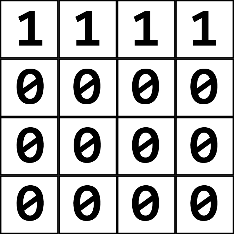
It's a typeface system built from just two shapes/glyphs. Instead of drawing letters by hand, every letter, number, and punctuation mark is created by arranging these two shapes inside a 4×4 grid of 16 cells.
Each cell is either filled [1] (with your first shape) or empty [0] (showing your second shape). This filled-or-empty pattern creates the letter. The system makes data visible—your letters are essentially binary code made readable. But still... Only for those who know ;)
GRID CODE SCHEMATIC
The math behind BiType relies on mapping a 16-bit array to a 4x4 spatial layout. Cell 1 starts at the top-left, wrapping to the right, and ending at cell 16 at the bottom-right. Active cells (1) draw stem bars; inactive cells (0) draw circular rings.
INFINITE POSSIBILITIES
BiType is not one typeface. It is a system: any two shapes on a 4×4 grid. What the two shapes are, and what the grid becomes, is up to you. It can be used in abstract ways as much as for writing:
The 16 cells as the structure of a poster, a pattern or a page.
Tiles, maps and surfaces that also spell something.
Facades, floors and walls built cell by cell.
Only understood by those who created it and who they shared it with.
And millions more, with infinite customisation and creation.
THE FOUR NATURES OF THE NAME
Bi = 2 (Two Shapes/Glyphs): Every letter, number, and punctuation mark is built from just two shapes: one for 1, one for 0.
Bi = 2² (The Squared Grid): Two squared is four. The grid is four cells wide and four cells tall: a square made of squares, 16 cells in all.
Bi = 2 (Typography and System): It is a typeface you can read and type with, and also a structure: a set of rules open to infinite interpretations, with any two shapes you choose.
Bi = 2 (Two Worlds Colliding): Data and human. The same grid is binary code for a machine and a letter for you.
GLYPH MAP & BINARY STRUCTURE
Hover over a character box below to examine its internal 4x4 matrix configuration and corresponding binary stream array.
ALPHABET SHOWCASE
DATA EXPOSURE & SURVEILLANCE
BiType was born in 2026 to make a point about how much we are being watched online. If all the hidden tracking cookies and data logs were drawn right on your face, would you notice them?
"If data collection were made visible through your own image, would you recognise yourself as a tracked entity?"
Every click you make is tracked and cataloged. BiType plays with this idea: what looks like random blocks or digital noise is actually a secret message. Once you know how to read the 4x4 grid, it's super easy to decode. It's hidden in plain sight!
THE GRID IS THE FONT
The first font you don't need to download! You can write it in apps and websites where you can only use text or simple images like Instagram, and you can encrypt messages. (Also, you can copy and paste it directly from the Creator tab!)
ENDCORE speculative campus project
For the ENDCORE project, I pasted custom posters all over campus to get people talking about privacy. Inspired by old-school "If you're reading this, it's too late" letters, the posters are warnings hidden in plain sight. I even made a poster using an ASCII-art selfie to show how tech companies turn our private photos into raw data grids.
DAW MIDI TRANSLATION
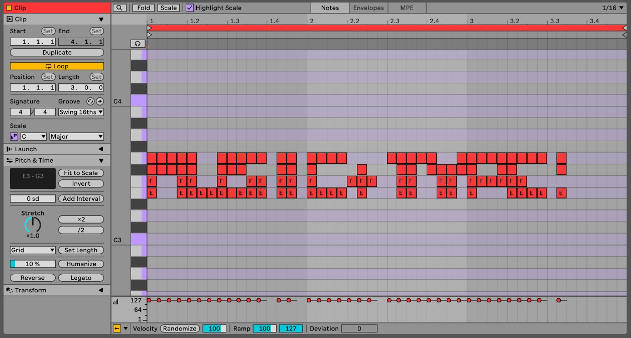
Did you know you can play BiType like an instrument? By mapping the 4x4 grids of letters to MIDI notes, you can feed text directly into hardware synths and DAWs (music production software).
Each solid cell (1) triggers a note, while empty cells (0) act as rests. Type a message, and it instantly plays back as a crazy chord progression or beat! Check out how we mapped the characters in our setup below:
ABOUT ME
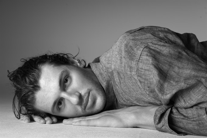
I am Jan A. Wojta, a 19 year old multidisciplinary artist. Born and raised in Barcelona with Polish nationality. I just left LCI Barcelona and I am now curating my portfolio. This is my first time building a web app, and I love to experiment with all kinds of creative mediums!
BiType is a fun project about hiding messages in plain sight. It combines my love for design, deep search, and community participation. I love experimenting, like using code to make art, ask questions, and think about how we share our lives online.
Big thanks to my friend Theo, this project wouldn't have been possible without your Claude membership!
Check out my other work!
Instagram: @janaleksanderwojtas
PRODUCTION PROCESS
The development of the BiType design system and web application followed a structured workflow translating conceptual sketches into a fully functional digital tool:
- Sketchbook: Initial conceptualization and grid drafts.
- Figma: Visual interface design and component layout.
- Claude: Coding structural logic, SVG exporters, and web interface elements.
- Antigravity AI: Refinement of the TTF custom compiler, visual overhauls, loading optimization, and GPU animation binding.
- GitHub: Version control and repository management.
- Vercel: Production deployment and global hosting.
A-TYPOGRAPHY
Credit goes to the conceptual and formal inspirations from A-Typography. Explore their typographic experiments below:
TEXT COPIER
Type any word or phrase. It is converted into 4x4 grids of 1s and 0s that you can copy and paste anywhere that takes plain text: an Instagram caption or bio, a chat message, a note, an email.
The grid lines up best where every digit has the same width, which is the case in most apps. Where it is not, the letters still read, just a little uneven.
COMING SOON...
MY LIBRARY
Individual glyphs made with the Creator. Each card is one pair: Glyph 0 fills the empty cells, Glyph 1 fills the filled ones. The small grid beside them is a letter built from that pair.